
The project
The challenge
A real challenge: the client was completely set against the classic symbols of travel (the feather and the plane), which she found too cliché. The work was to break down those assumptions by proving that traditional imagery, handled with finesse and modernity, becomes a powerful way to be recognised. The identity had to evoke both the lightness of the planning (the feather) and the reality of the adventure (the plane).
The answer
An emblem that fuses both symbols into a single fluid, organic silhouette. The feather cradles the plane, a journey carried and framed by the travel planner's expertise. The type was stripped back to leave room for this strong symbol. The proposal was a revelation for the client, who approved at once a direction she had first ruled out.
The style
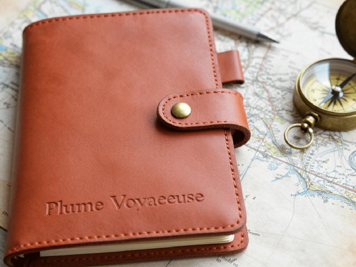
A warm, earthy, adventurous aesthetic. The palette draws on sunsets and ochre lands (burnt sienna, terracotta and deep chocolate). These earth tones bring a human, authentic feel, far from the cold, generic blues of the travel industry.
The world
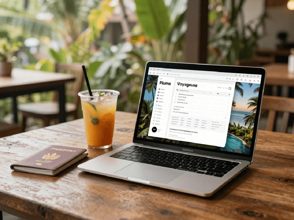
The call of the open air and the calm of departure. A world built for travellers looking for a tailored escape, where every detail is planned with the lightness of a feather. The identity of organised freedom.
The result
An iconic visual identity that won the client over and changed how she sees her own brand. Plume Voyageuse now has a warm, professional image that stands out with its ochre tones and strong symbol, and is remembered at once by its audience.