
The project
The challenge
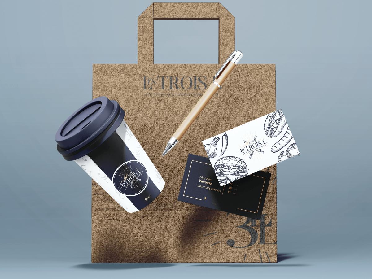
Make a fast-food brand look professional by giving it a handmade, high-end identity. The goal was a complete visual system that works as well on a shopfront sign as on very different packaging (cups, bags, menus).
The answer
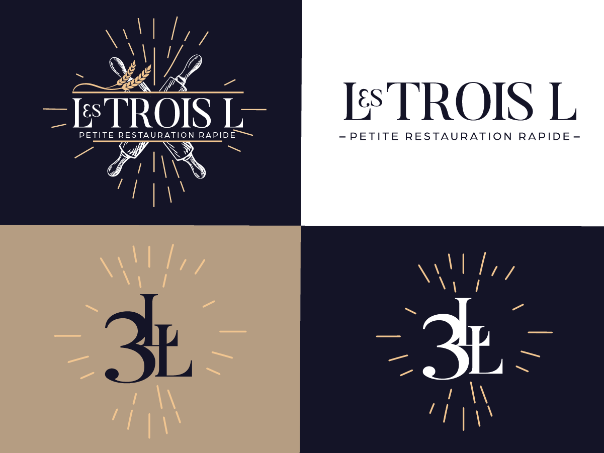
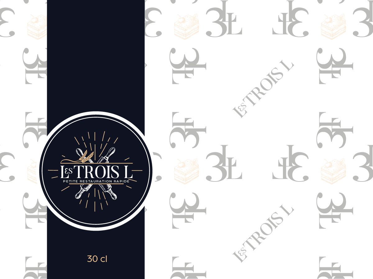
A holistic identity. The main logo uses craft codes (rolling pins, quality stars) to underline the homemade promise. Modular versions, a "3L" monogram for small-format branding and a signature pattern to strengthen recognition on packaging.
The style
A balanced "neo-bistro" aesthetic. Deep midnight blue brings elegance and seriousness, while sandy beige recalls the authenticity of raw ingredients. Serif type and radiating lines create a sunny, welcoming energy.
The world
Indulgence without compromise. A quick-service world that makes no compromise on visual quality, from the shopfront down to the smallest takeaway packaging detail.
The result
A consistent, impactful brand that changes the customer experience. A unified shopfront, stationery and cup design make Les Trois L a reassuring, memorable reference.