The project
The challenge
Maison Néferty supports families in Fort-de-France: perinatal care, breastfeeding, parent-baby bond, couples and parenting, well-being. The identity had to feel warm and sacred, reassuring without ever looking like a spa.
Graphic identity
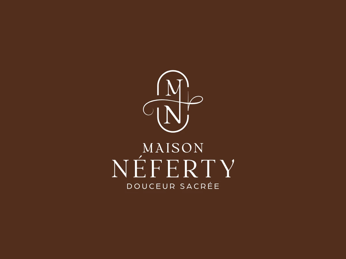
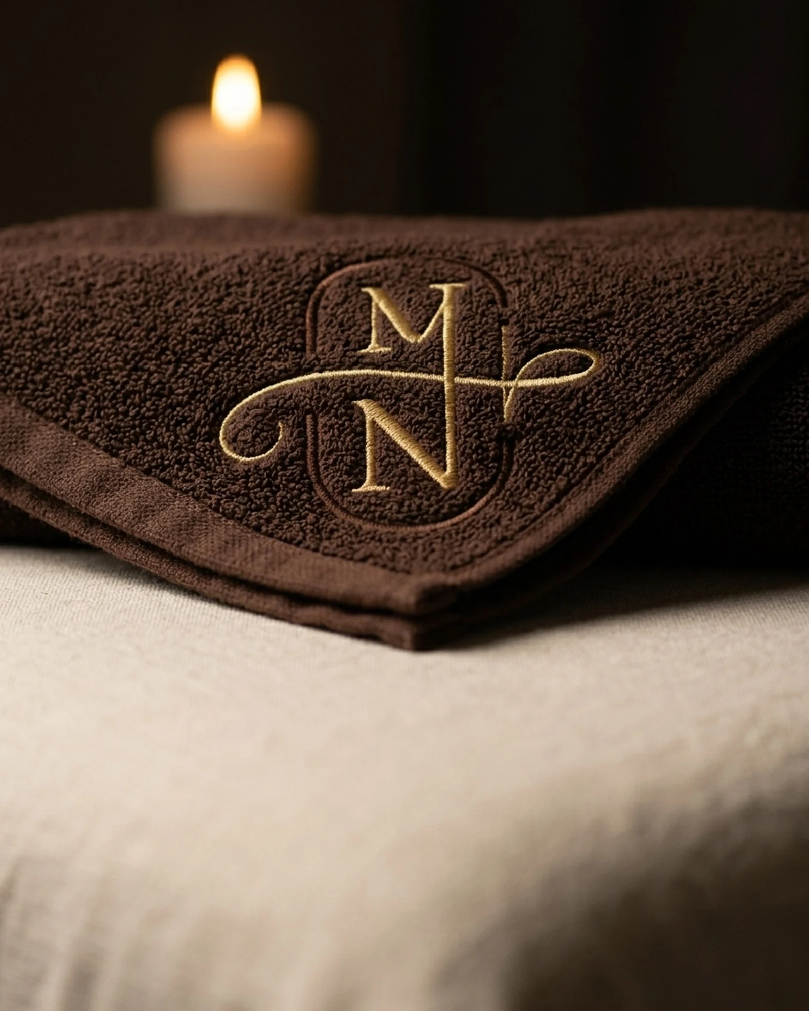
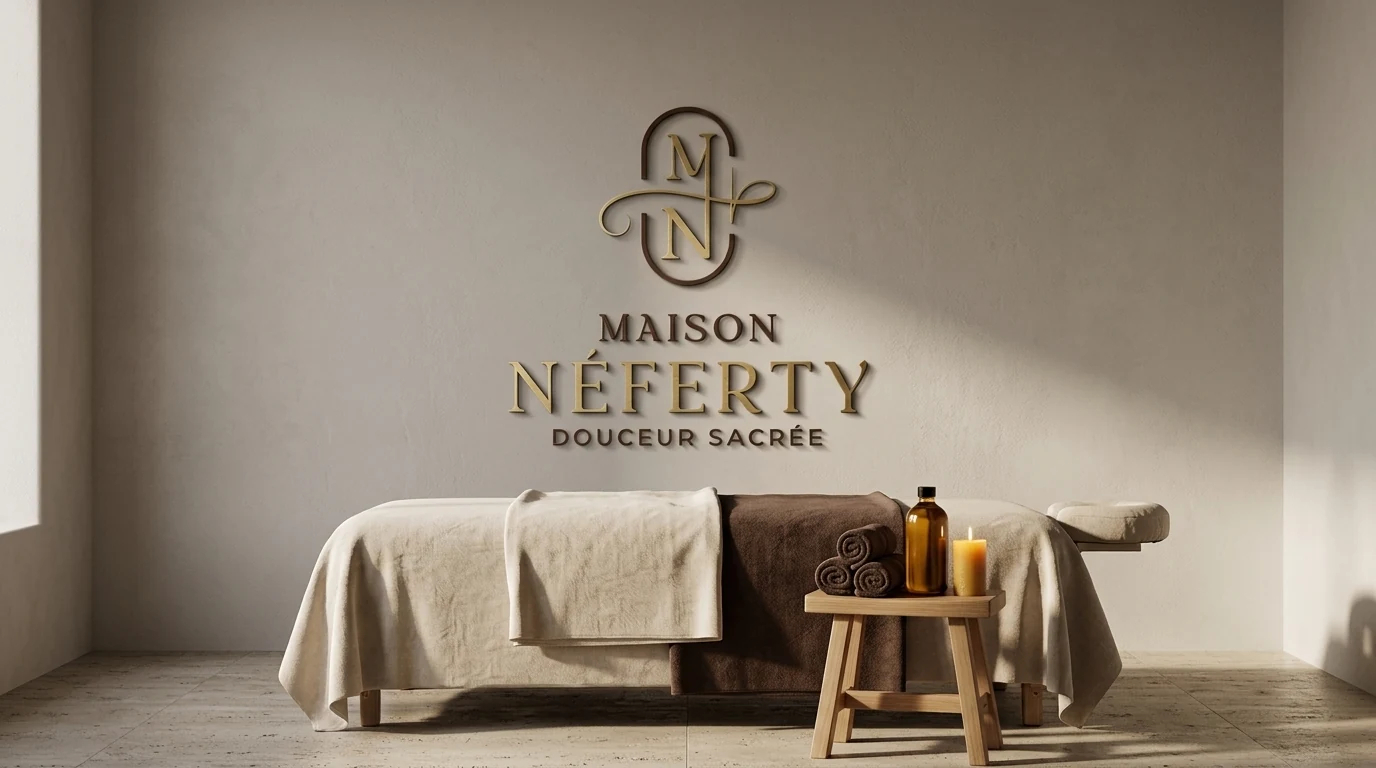
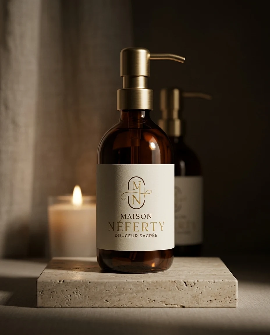
An M and N monogram in a capsule, crossed by a golden thread ending in a needle. Elegant typography and the tagline "Douceur sacrée". Delivered in colour, black and white, horizontal, vertical and as a stand-alone symbol.
The style
Deep cocoa, antique gold, ivory. A soft, dark luxury, like a cocoon.
SUPPORTS
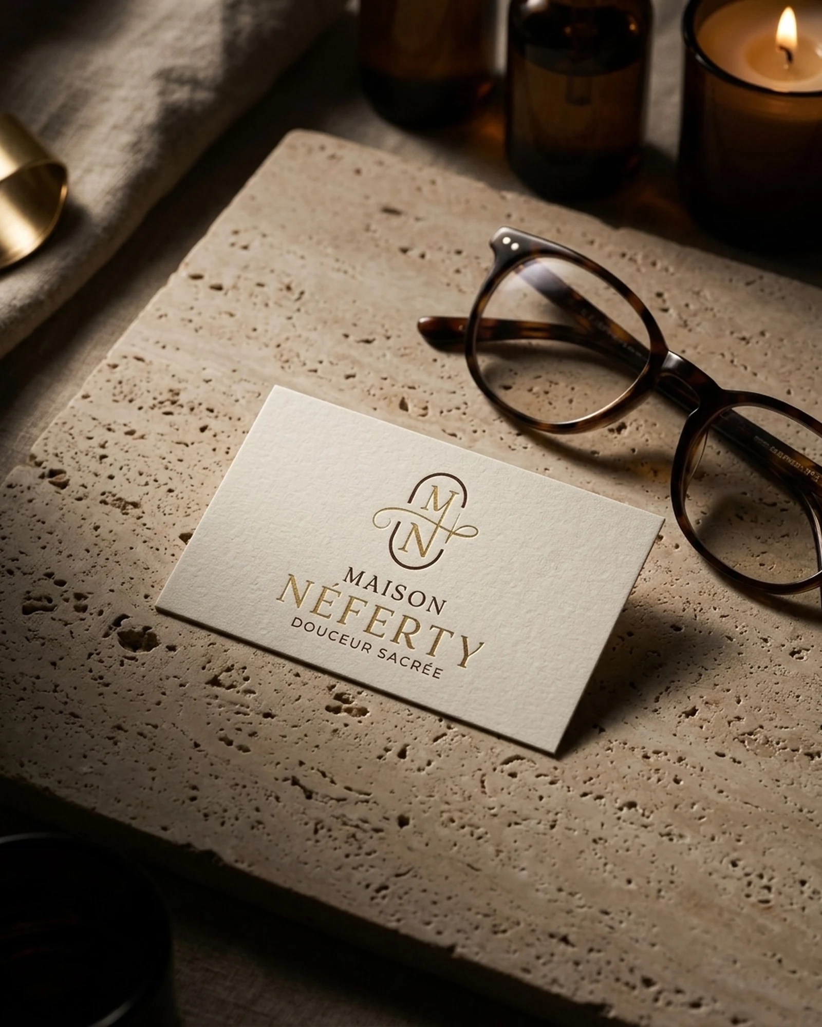
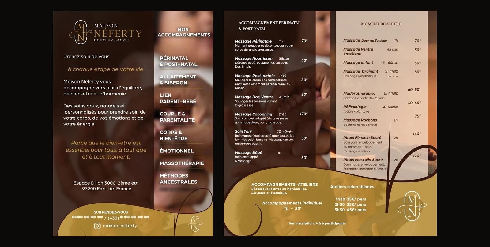
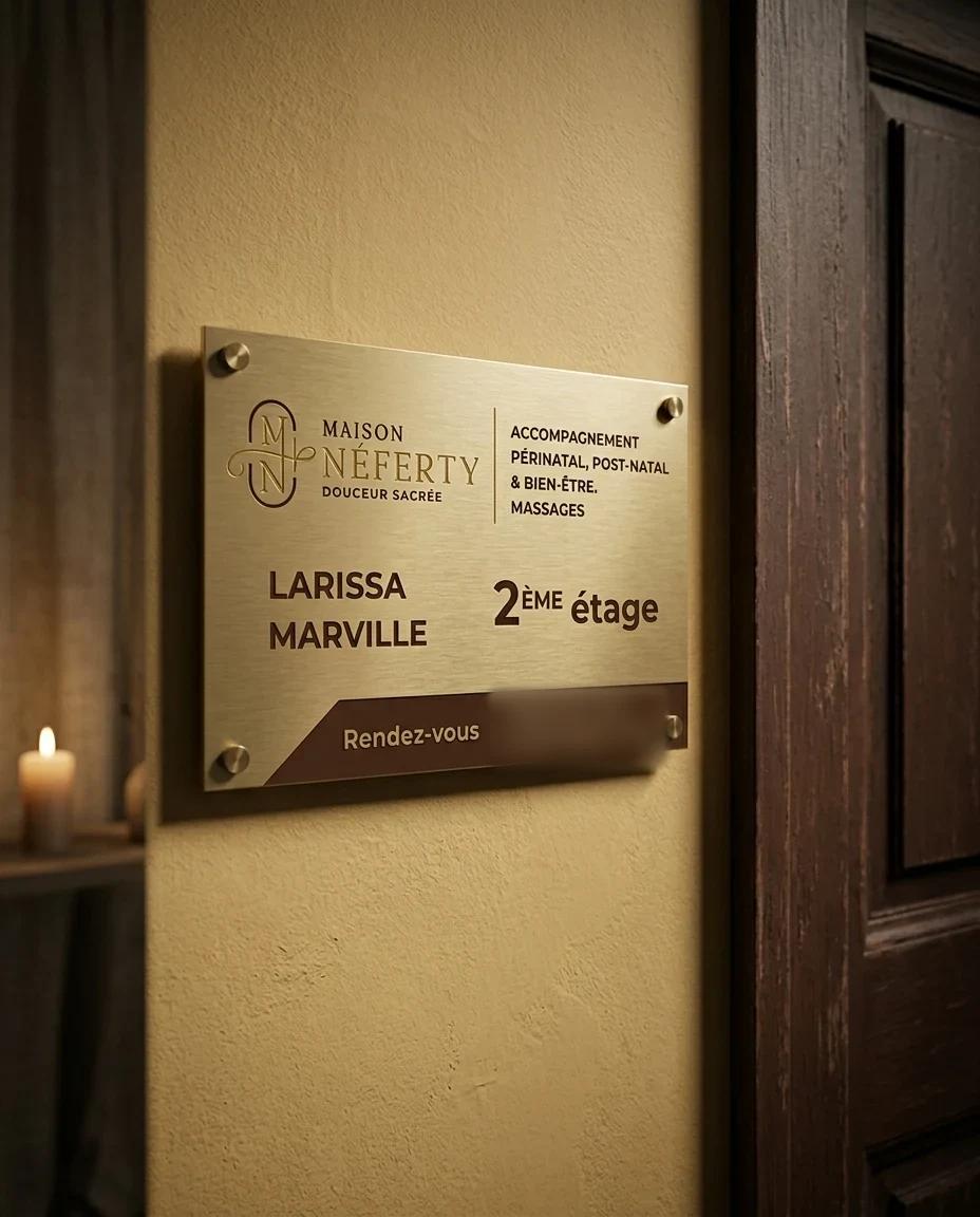
Business card and two-fold DL leaflet ready for the printer, door plate, shop sign, and a complete brand guide delivered to the client.
The result
A consistent brand from the monogram to the door plate, delivered and approved. The client uses it across all her materials.