The project
The challenge
Give Phoenix Digital a brand stature as strategic as it is creative. The goal was to move past the usual codes of community management and set a premium, modular visual identity that adapts smoothly to every touchpoint, from mobile to stationery.
The answer
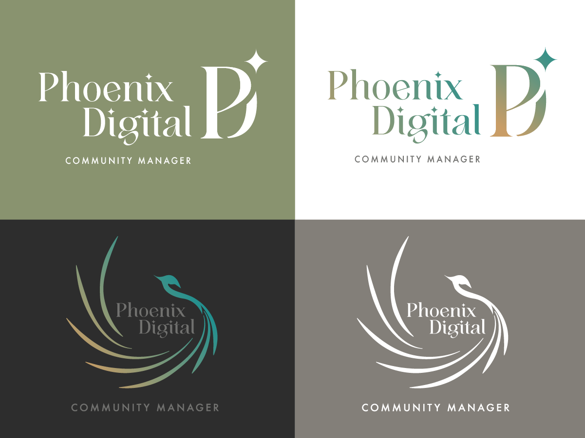
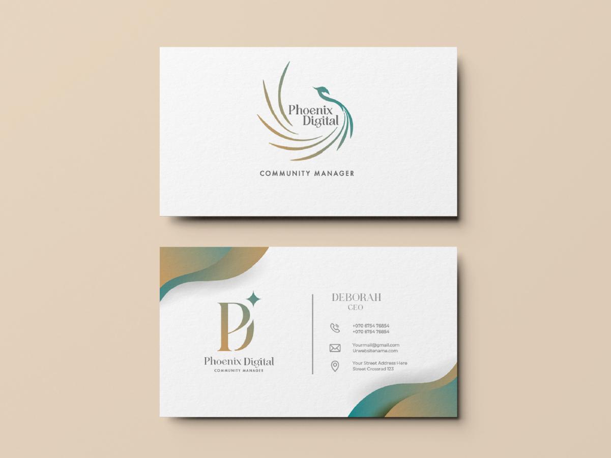
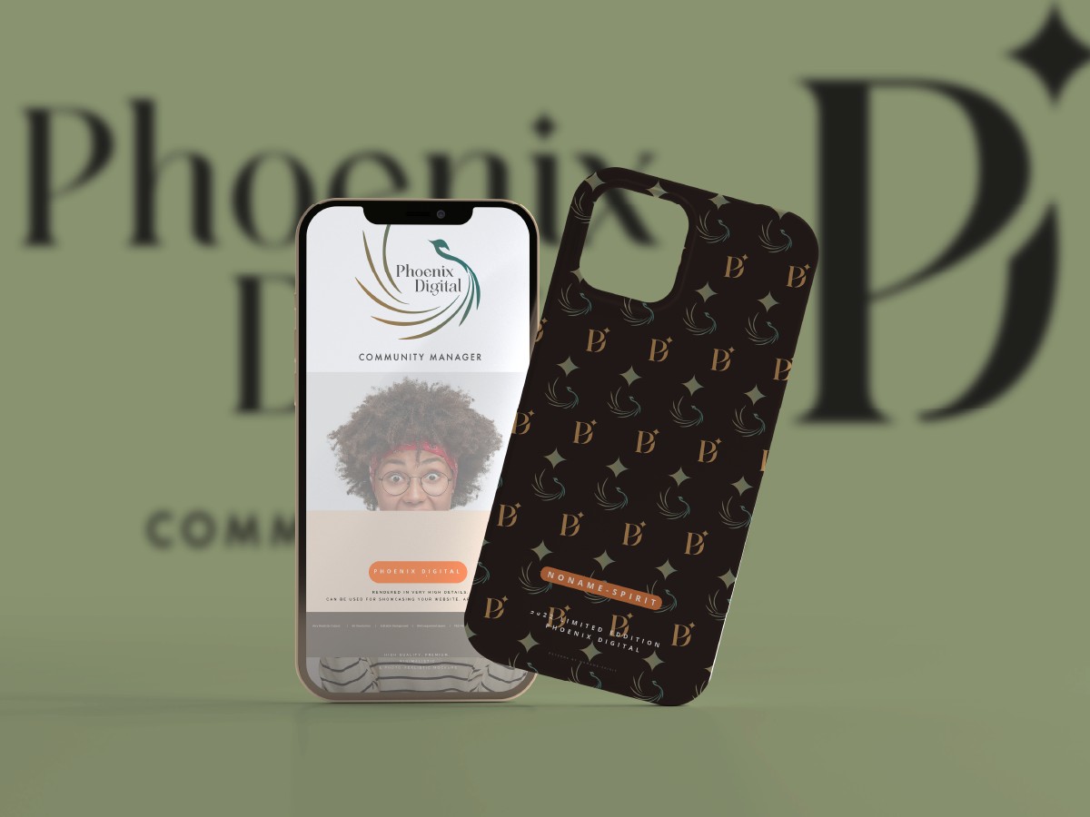
A complete, versatile visual identity system. A smart logo with several versions: the "PB" monogram for impact, the "Phoenix" icon for meaning and the wordmark for clarity. The work also includes a signature pattern and premium stationery.
The style
Organic elegance carried by fluid, minimal lines. The palette balances a calming sage green with the prestigious warmth of gold, for a refined, timeless contrast.
The world
A digital rebirth. A world where strategic rigour meets artistic finesse, built for a brand that makes its clients' image shine with distinction.
The result
A consistent, striking visual identity that is recognised at once. Phoenix Digital now has a complete graphic ecosystem that showcases its expertise and builds trust.