
The project
The challenge
Translate a high-precision technical act, micropigmentation, into an image. The logo had to evoke both the near-surgical rigour of the gesture and the artistic subtlety of the result, and show pigmentation elegantly without falling into beauty clichés.
The answer
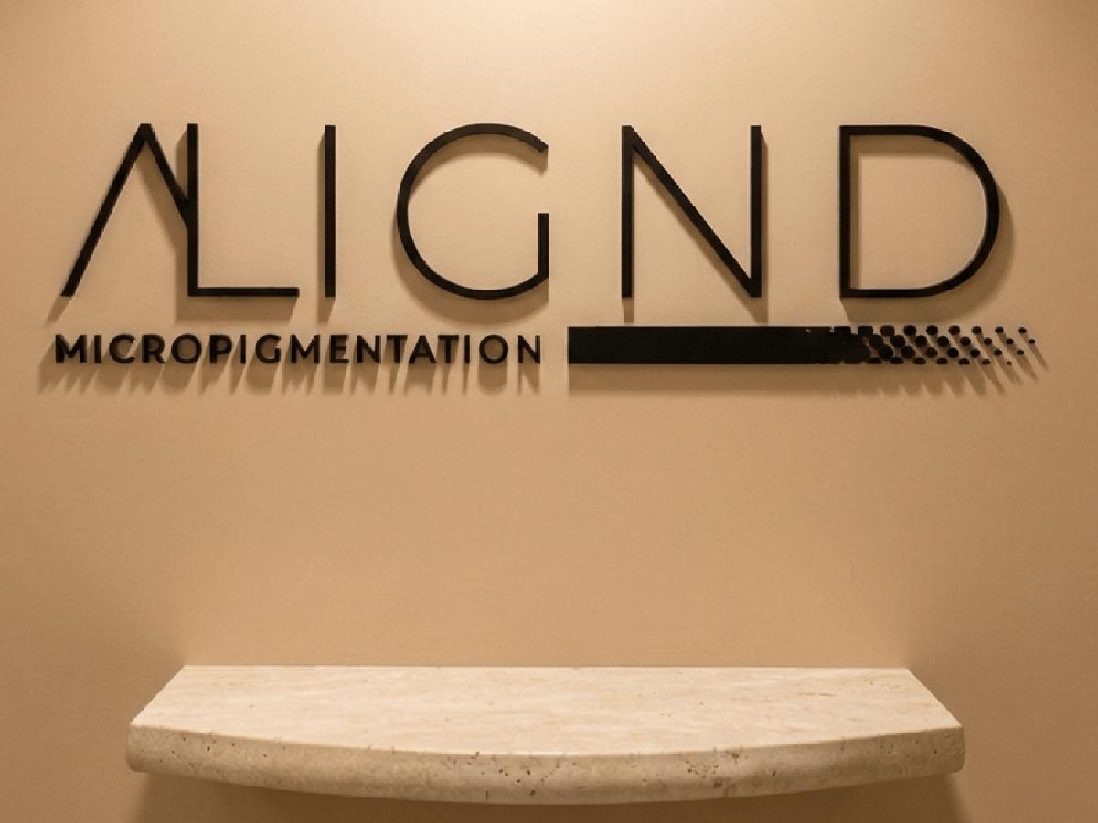
A minimal, architectural typographic logotype. The work focuses on the letter "A", part of which breaks down into a gradient of dots, a direct picture of microshading and of pigment settling into the skin. The contrast between solid line and dots stands for the move from need to transformation.
The style
A "luxury medical" aesthetic. The palette draws on universal skin tones: a sand beige for softness, a deep black for authority and precision. Clean type with discreet serifs anchors the brand in a world of expertise and trust.
The world
Millimetre precision. A world where balance and symmetry rule. It is the identity of a practitioner who sees beauty as an exact science, for clients who look for excellence, discretion and a tailored result.
The result
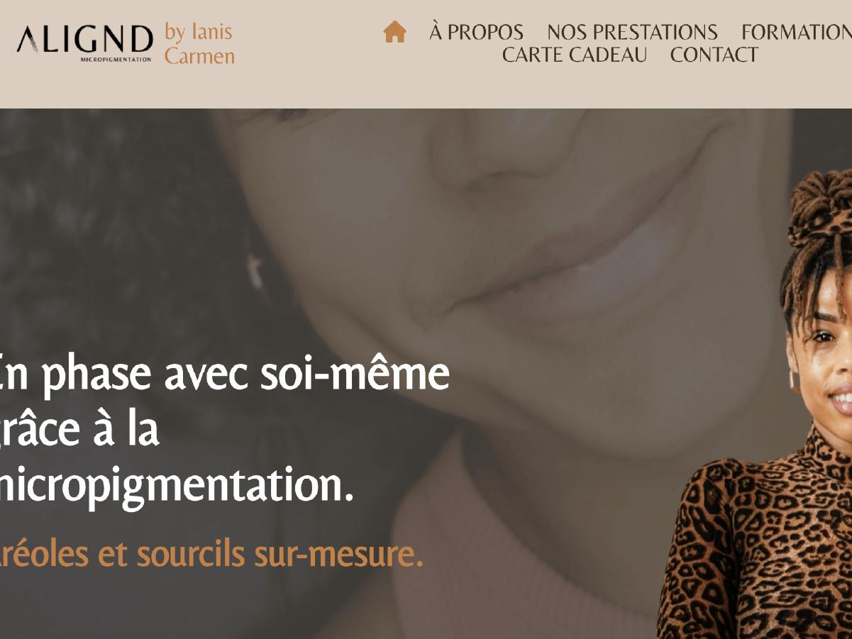
A strong visual signature, recognisable at first glance. The ALIGND logo instantly positions the practitioner as a high-end expert. The brand becomes a promise of reassurance, essential for a service where the client's trust drives the sale.